Create NSW
ROLE
Lead UX/Visual Design in OneCX program
TASK
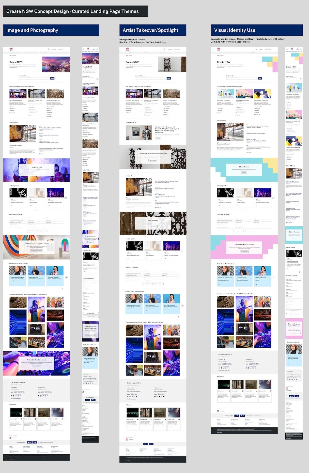
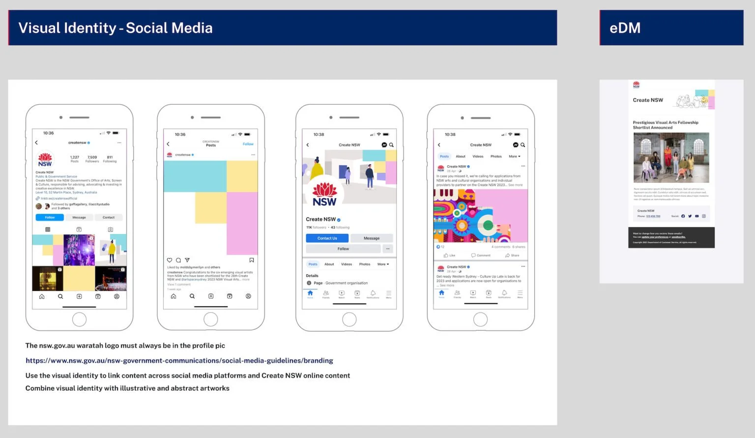
As part of the nsw.gov.au OneCX program migrating existing government agencies and organisation websites over to one platform under nsw.gov.au the task was to design concepts for the current Create NSW in turn improve the experience by creating seamless access and user journeys to Create NSW content such as latest artist and infrastructure grants information, news, funding recipient stories and showcases, resources and toolkits via a new designed landing page and topics pages under nsw.gov.au that utilise the mobile first responsive components from a evolving design system. Included in the design process was the introduction of a visual identity that would highlight Create NSW content and allow users to follow that content across a journey and find the right information.
CURRENT EXPERIENCE
Create NSW’s existing website is outdated and not mobile first responsive. Content was hidden and relies on older style cms components that don’t allow for easy access to content.
PROPOSED SOLUTION
Through reinventing the IA, a visual identity and the use of a design system components I was able to design an engaging and mobile responsive interface that enabled users to find creative grants and funding information easily. Using google analytics from their current website I was able to identify what content was valuable to users and in turn arranging a hierarchy of content on the landing page and sub pages. With new components tied to data analytics software in a future build Create NSW would be able to track what content is of value and adapt the site accordingly.


